|
|
4 anos atrás | |
|---|---|---|
| .github | 5 anos atrás | |
| R | 4 anos atrás | |
| data | 4 anos atrás | |
| data-raw | 4 anos atrás | |
| inst/extdata | 7 anos atrás | |
| man | 4 anos atrás | |
| tests | 6 anos atrás | |
| .Rbuildignore | 4 anos atrás | |
| .gitignore | 10 anos atrás | |
| .travis.yml | 6 anos atrás | |
| DESCRIPTION | 4 anos atrás | |
| LICENSE | 8 anos atrás | |
| NAMESPACE | 6 anos atrás | |
| NEWS.md | 4 anos atrás | |
| README.Rmd | 4 anos atrás | |
| README.md | 4 anos atrás | |
| appveyor.yml | 6 anos atrás | |
| codecov.yml | 6 anos atrás | |
| cran-comments.md | 8 anos atrás | |
| statebins.Rproj | 10 anos atrás | |
README.md

![]()
![]()

![]()
![]()
![]()
statebins
Create United States Uniform Cartogram Heatmaps
Description
The cartogram heatmaps generated by the included methods are an alternative to choropleth maps for the United States and are based on work by the Washington Post graphics department in their report on “The states most threatened by trade” (http://www.washingtonpost.com/wp-srv/special/business/states-most-threatened-by-trade/). “State bins” preserve as much of the geographic placement of the states as possible but have the look and feel of a traditional heatmap. Functions are provided that allow for use of a binned, discrete scale, a continuous scale or manually specified colors depending on what is needed for the underlying data.
What’s Inside The Tin
The following functions are implemented/datasets included:
-
geom_statebins: A statebins Geom -
state_tbl: “State” abbreviation to name data frame -
theme_statebins: Base statebins theme -
statebins: (the original sole function in the package) Create a new ggplot-based “statebin” chart for USA states/territories
Installation
install.packages("statebins) # NOTE: CRAN version is 1.2.2
# or
install.packages("statebins", repos = c("https://cinc.rud.is", "https://cloud.r-project.org/"))
# or
remotes::install_git("https://git.rud.is/hrbrmstr/statebins.git")
# or
remotes::install_git("https://git.sr.ht/~hrbrmstr/statebins")
# or
remotes::install_gitlab("hrbrmstr/statebins")
# or
remotes::install_bitbucket("hrbrmstr/statebins")
# or
remotes::install_github("hrbrmstr/statebins")
NOTE: To use the ‘remotes’ install options you will need to have the {remotes} package installed.
Usage
All of the following examples use the WaPo data. It looks like the columns they use are scaled data and I didn’t take the time to figure out what they did, so the final figure just mimics their output (including the non-annotated legend).
library(statebins)
library(cdcfluview)
library(hrbrthemes)
library(tidyverse)

# current verison
packageVersion("statebins")
## [1] '1.4.0'
The original wapo data
adat <- read_csv(system.file("extdata", "wapostates.csv", package="statebins"))

mutate(
  adat,
  share = cut(avgshare94_00, breaks = 4, labels = c("0-1", "1-2", "2-3", "3-4"))
) %>%
  statebins(
    value_col = "share",
    ggplot2_scale_function = scale_fill_brewer,
    name = "Share of workforce with jobs lost or threatened by trade"
  ) +
  labs(title = "1994-2000") +
  theme_statebins()

Continuous scale, legend on top
statebins(
  adat,
  value_col = "avgshare01_07",
  name = "Share of workforce with jobs lost or threatened by trade",
  palette = "OrRd",
  direction = 1
) +
  labs(x="2001-2007") +
  theme_statebins(legend_position="top")

Continuous scale, no legend
statebins(adat, value_col = "avgshare08_12", palette = "Purples") +
  labs(x="2008-2010") +
  theme_statebins(legend_position = "none")

Mortality data (has Puerto Rico)
# from: http://www.cdc.gov/nchs/fastats/state-and-territorial-data.htm

dat <- read_csv(system.file("extdata", "deaths.csv", package="statebins"))

statebins(dat, value_col = "death_rate", name="Per 100K pop") +
  labs(title="Mortality Rate (2010)") +
  theme_statebins()

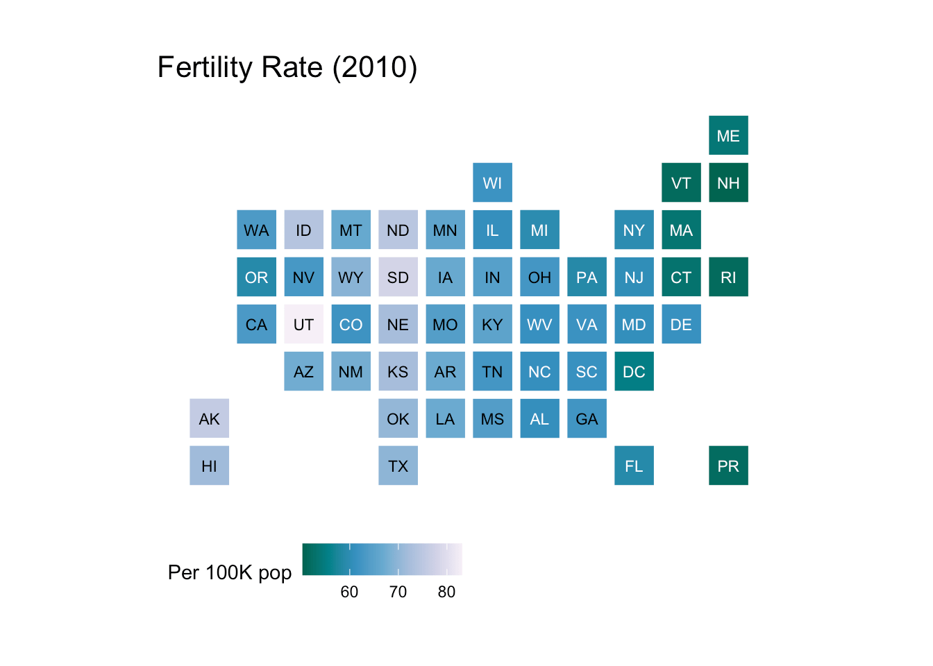
Fertility data
statebins(dat, value_col="fertility_rate", name="Per 100K pop", palette="PuBuGn") +
  labs(title="Fertility Rate (2010)") +
  theme_statebins()
Manual - perhaps good for elections?
election_2012 <- suppressMessages(read_csv(system.file("extdata", "election2012.csv", package="statebins")))

mutate(election_2012, value = ifelse(is.na(Obama), "Romney", "Obama")) %>%
  statebins(
    font_size=4, dark_label = "white", light_label = "white",
    ggplot2_scale_function = scale_fill_manual,
    name = "Winner",
    values = c(Romney = "#2166ac", Obama = "#b2182b")
  ) +
  theme_statebins()

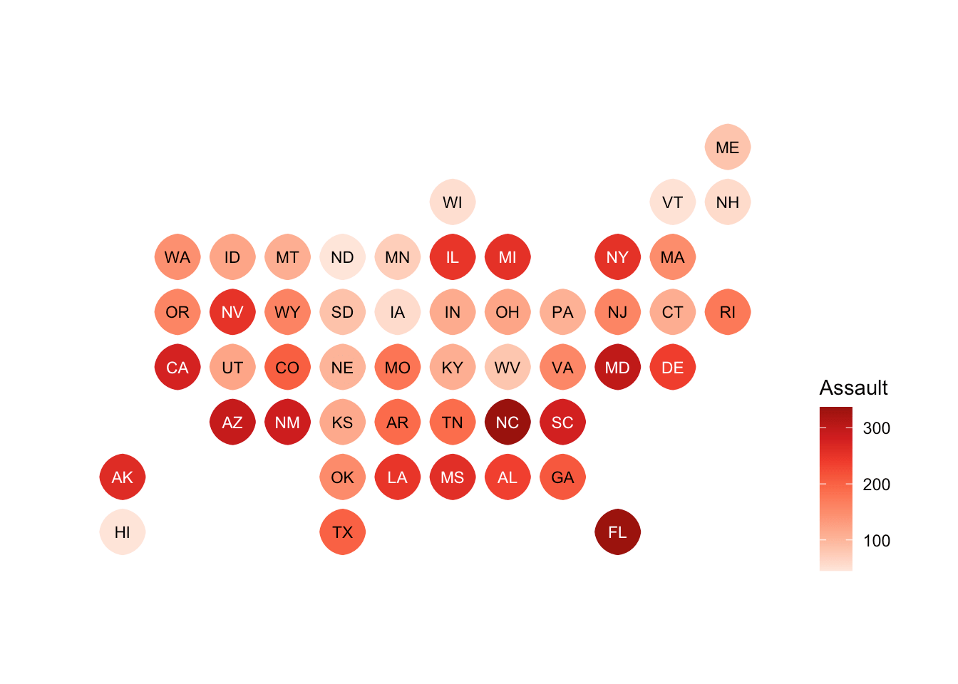
Rounded rects!
You can pass in a grid::units() call for the radius parameter.
Slight curves:
data(USArrests)

USArrests$state <- rownames(USArrests)
statebins(USArrests, value_col="Assault", name = "Assault", round=TRUE) +
  theme_statebins(legend_position="right")

Circles!
statebins(USArrests, value_col="Assault", name = "Assault", round=TRUE,
          radius=grid::unit(16, "pt"), palette="Reds", direction=1) +
  theme_statebins(legend_position="right")
Geom
flu <- ili_weekly_activity_indicators(2017)

ggplot(flu, aes(state=statename, fill=activity_level)) +
  geom_statebins() +
  coord_equal() +
  viridis::scale_fill_viridis(
    name = "ILI Activity Level  ", limits=c(0,10), breaks=0:10, option = "magma", direction = -1
  ) +
  facet_wrap(~weekend) +
  labs(title="2017-18 Flu Season ILI Activity Level") +
  theme_statebins(base_family = font_ps) +
  theme(plot.title=element_text(size=16, hjust=0)) +
  theme(plot.margin = margin(30,30,30,30))

All the “states”
statebins now has PR, VI & NYC (by name or abbreviation) so you can
use them, too:
library(statebins)
library(tidyverse)
library(viridis)

data(USArrests)

# make up some data for the example

rownames_to_column(USArrests, "state") %>%
  bind_rows(
    data_frame(
      state = c("Virgin Islands", "Puerto Rico", "New York City"),
      Murder = rep(mean(max(USArrests$Murder),3)),
      Assault = rep(mean(max(USArrests$Assault),3)),
      Rape = rep(mean(max(USArrests$Rape),3)),
      UrbanPop = c(93, 95, 100)
    )
  ) -> us_arrests

statebins(us_arrests, value_col="Assault",
          ggplot2_scale_function = viridis::scale_fill_viridis) +
  labs(title="USArrests + made up data") +
  theme_statebins("right")
